
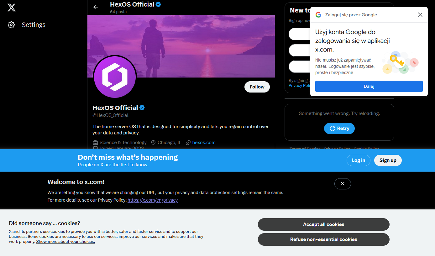
I happened to click a link that took me to the associated twitter X account for something I was interested in and was greeted by not one, not two, but four modern day web popups.
I know it’s nothing new. I’ve got a couple of firefox plugins that are usually quite good at hiding this sort of nonsense, but I guess they failed me today (or, I shudder to think, there were even more that were blocked, and this is what got through)
What’s the worst new/not-signed-in user experience you’ve encountered recently?
GIVE US YOUR DATA GIVE US YOUR DATA GIVE US YOUR DATA
PLEASE HERE TAKE IT
(Just please stop yelling at me)
It took long enough but the pop-ups evolved into new pop-ups.
deleted by creator
I really really do miss old school internet and feel kinda bad for people who never get to experience it. I know i sound like a cunt, and maybe it’s just nostalgia, but when the internet was bound to a computer and it was mainly “nerds” using it, it was such a better time. I remember a time where the internet was fast enough for pictures and small videos, but having your own picture somehow on the internet was witchcraft to me. Scanner, cameras who are digital whaaat? Now most of the internet is ads and pictures of people who i don’t give a shit about. People’s opinion, picture of people, fuck off bring back the time where the internet was either forums or someone’s weird website, where you only stumbled upon because you typed in a web adress i. The hopes it leads you somewhere.
I had a girlfriend who was truly fascinated by the fact that i don’t have social media and that i’m not “on the internet” like she didn’t find me and my stupid face anywhere on the web. She was often wondering what i was doing on the internet if i don’t have social media, because that was the internet to her. Facebook, instagram, tiktok and youtube.
Whenever I get to a webpage that looks a decade old (like most recently Ventoy) I get hit with a wave of nostalgia. Yeah, it might not look great or be very responsive to my actions, but my god does it feel great to just get thebinfo you need front and center.
She was often wondering what i was doing on the internet if i don’t have social media, because that was the internet to her
~ shudders ~
There was a screenshot I once saw of a Chinese netizen’s web browser in the late-2000’s, using Internet Explorer 6 and tonnes of third-party toolbars. I think I saw it back when Digg was still a thing. We’ve now reached the age where major websites are more cluttered with notifications than a malware-infected browser was 15 years ago, and where everybody is tracking everything that you do online.
25 years ago, we legitimately drove RealNetworks into the ground for a lot less than what we’re allowing Google, Microsoft, Meta, X, etc to get away in the modern day.
*xitter
EU: “You can’t just collect people’s data, you have to ask permission first and give people the opportunity to decline.”
Site Developers: “Fine, but we’re going to comply in the most malicious manner possible.”
HEY DO YOU WANT COOKIES ARE YOU SURE PLEASE HIT THE BIG BLUE BUTTON FOR COOKIES THEY ARE HELPFUL AND GOOD PLEASE GIVE COOKIES!!!
It’s hilarious on a widescreen setup how many websites aren’t adaptive but that cookie pop-up blocks 3/4 in 5000% font size.
It’d be fun if the EU started policing any use of the phrase “We are required to show this dialog”.
They’re not. They choose to show that dialog so that they can try to apply commercial tracking cookies. Anything for website function is already covered by EU laws.
There have been a couple of changes to the rule since it came into effect. Originally, the pop up could effectively occlude the “Do Not Enable Cookies” button behind a maze of “Optional” settings. The end result was a big colorful “I Consent” button and a tiny little gear button with a thousand manual checkboxes to uncheck every time you visited the site.
The regulations were updated since. Now these annoying pop-ups at least tend to have a clearly defined “Yes, I Consent” / “No, I Do Not” at equal scale and opposite color, allowing you to bypass it without going into the weeds on a configuration screen.
The corporates keep finding ways to reintroduce the same shitty popup ads from the 90s to defeat whatever’s been put in place to keep it from happening. Absolutely no sense of nuance. It’s not the specific delivery mechanism users dislike, it’s the whole terrible UX pattern. Stop trying to make me do shit that’s not what I’m trying to do!
Anybody know why google has a popup on every major website now? And more importantly, how to get rid of that without creating an account?
Disable all third party JS in uBlock origin
this comment will not get any upvotes from anyone who follows it 😁
Why? It’s how I browse every day
It’s really interesting, I hadn’t tried this in a long long time. Some sites are simply broken, others drag themselves along half broken, but lemmy seems to be doing alright weheee
I use uBlock’s “Medium mode” that (for some reason) is hidden behind several obscure steps: https://github.com/gorhill/uBlock/wiki/Blocking-mode:-medium-mode
Anyway, yeah, it pretty much breaks every website the first time you visit. Well, every domain at least. But once you figure out which scripts to allow to get it functioning, you can save individual settings for each site/domain that load automatically every time you visit afterwards.
That can cause the page to fail to load in some instances.
Some specific websites might need tweaking but from anecdotal evidence about 90% of websites work just fine. YMMV though because I don’t visit twitter
A number of the more tech savvy online newspapers have begun enforcing client-side scripts as a means of preventing people from reading articles without a subscription.
And they get to deal with a combo of NoScript and UBlock origin from my Librewolf instance. If I really can’t get in, I’m going to HackerNews
uBlock Filter:
||smartlock.google.com
||accounts.google.com/gsi/$3p
||id.google.com^You mean uBlock Origin, right?
Yes, that’s the only one you should use
It works 🫡 thank you 😊
We can sell 80 percent of the screen without inducing seizures!
*without reaching statistically relevant levels of seizure induced deaths.
*without being sued for more than we would make from seizure induced deaths
*without being successfully sued for more than we would make from seizure induced deaths.
*without being successfully sued for more than we would make from seizure induced death, outside of an arbritration court thank to our ToS
What the fuck is this post? fuck off back to your X/fagbook retard.
deleted by creator
just fork chromium again; why use a toolbar when you can have the whole browser!
Gemini is an attempt at trying to bring the old web back, although with some technical limitations.
While the web is looked at as a superstore rather than a library, function will dictate form.
I heavily disagree with this. Stepping back to “walls of text with hyperlinks” is a bad idea that’ll service no one and will never succeed in any reasonable capacity.
Current web technology is not what caused bad web. The exception would be too powerful js where js should only provide interactivity and extra flavor to the page rather than run a full application which can fingerprint and punish user agents.
Javascript, embeded images and audio are awesome things that can improve content readability a thousand fold. Just look at best docs on the web - all of them use these features to tend their users. Even wikipedia added js flavoring like hover pop ups. Because it works.
I actually prefer a mostly text web. If the trade off for ditching JavaScript is not getting hovering pop ups, I’m fine with that. I think that while JavaScript can help with usability, it’s main use right now is being a pain in the ass. Images and video are useful, don’t get me wrong, and that will always be the most popular “use” of the internet, but most of the time I just want to go on the Internet and read cool shit without fifty different corporations trying to fuck me over with the promise of “enhanced usability”. Like a link has to have some floating bullshit for me to click it. Absolute madness.
But lack of ability does not prevent any of that. Entrepreneurs who want to monetize stuff will find a way to spam and game the system.
As someone whos responsible for docs and public facing material I’d never push text only content these days. There’s just way too much UX value left out with this limitation. Sometimes more is more.
Additionally I’d argue that people who only want text are have advantage in the current system as you can strip and reformat everything on the front end and nobody will ever know or bully you into accepting their system. Just like nobody cared about ad blockers before they were widely adopted.
For me, multimedia is a non-negotiable part of the web experience.
Yes, I get as annoyed as the next guy when I want, say, a simple tutorial written in a couple paragraphs, but the only ones anyone seem to want to make are eight minute long videos filled with fluff. That sucks. But purposefully excluding it from your protocol because it burned you a fee times is a gross overcorrection in my view.
I appreciate the Gemini project, I respect its goals, and I am happy that it meets the needs of several people such as yourself. But for me, and I think for a great majority of people who would be potentially interested in its broader goal of simplifying the web but are dealbroken by lack of multimedia capabilities, Gemini will never be anything more than a toy. A quirky little curiosity that will never expand beyond a tiny clique of people who accept Gemini for what it is and are content to only ever see content from that same small pool of people.
It’s actually a pretty tasty coffee.
I have a very hard time believing that these companies are unaware of how auful this shit makes their webpages.
deleted by creator
If you ever want to read anyone’s tweets somewhat chronologically or see someone’s latest tweet, you’re gonna create an account.
Tweets as view on people’s profiles are totally scrambled (presumably to thwart LLM-feeding scrapers).
If this were a competent company, I’d say that they’re entirely aware of it and how fucking awful it is, but that there’s a mandate coming from somewhere that the page MUST include x, y and z and so they add x, y and z but usually try to at least make the site usable.
This being Twitter, though, I’m sure it’s because a screaming man-child threw a sink at someone and told them to do it or they’ll be fired and so they did it in the most half-assed obnoxious way they could manage.
Common language used to dismiss bad decisions like this:
- We need to track and meet our metrics for the quarter
- Engagement for $FEATURE is down, so we have to take measures to get people to take notice
- It’s opt-in/opt-out, so it’s the right thing to do
- It’s only a one time thing and then the system remembers1 what the user selected
- Only new users are affected - our power users will put up with it
- It’s just a minor inconvenience, really
- It’s just a website
1 - Oh, did you turn off cookies or clear your cache? Sorry about that.
Pretty sure you just triggered every developer and/or person who had to sit through a product meeting.
Though you missed the last bullet point: Our user surveys showed that people would actually prefer these changes
I barely see them pop up, if they do it’s for a fraction of a second before a browser extension nukes them.
It’s intentional, they want you logged in so they can track what you’re doing
iT’s bEtTeR iN tHe aPp
Oh they’re aware, they just don’t care 99% of the time.
It’s diminishing customer experience creep, except the company doesn’t understand what the user data means. They run A/B tests of different layouts, seeing what kind of feedback each gets to learn more about design choices and users. Each version should get its own feedback and then that data is compiled by data scientists into actionable feedback, things that can be done to improve the website in the direction the company thinks is an “improvement”.
Twitter abandoned those data scientists with the initial layoffs. There is no one to tell them what works and what impacts the customer experience, which is why each time the internal question of “how do we open up for engagement?” they answer it the same way, “Use existing user bases by linking their account to Twitter.” The result is several login requests all looking for the same cookie.
It’s lazy or inexperienced management. Knowing the type of person Elon hires, it’s probably both.
I do a lot of my browsing from an iPhone 11. At least twice a day, a page will crash and reload halfway through whatever article I was trying to read. I get it’s a few generations old, but since when do you need state of the art tech to view what should be a static page.
Anyone can make a good website. It takes a real engineer to make a horrible website that people will use just enough while suffering.
That’s a very good quote.
Inspired from the quote “Any idiot can build a bridge that stands, but it takes an engineer to build a bridge that barely stands.”
Source: Unknown
Well, unless you’re a nerd, you only see those messages once
I mean, they kinda don’t. Companies are entities made out of policies guiding how people split up objectives into smaller parts. The more people involved and the more indirect it is, the less coherent it gets
Legal says you need one popup for compliance. Marketing or analytics say you need more users to log in. Elon wants to remind people to call it Twitter.
By the time it filters through managers to the devs, they probably know it’ll be a horrible experience, but what are they going to do? It’s not their job. They’ll get brushed off. There might even be a compelling reason to do it in this way - with this in particular, annoying and intrusive popups are malicious compliance with the EU cookie laws. But everyone seems to be doing it this way - that’s probably what legal is going to recommend rather than interpreting the law themselves
So the problem is the structure. If you want a hierarchy of obedient replaceable cogs, you’ve made sure no one sees the full picture
on top of what others have said - directing you to the app and login - it’s also likely just that teams don’t talk and make decisions that solve their local issue without too much for the whole, and then say “ugh team x solved this so inelegantly! we were forced to do our thing that wasn’t as nice!”
I LOATHE that fucking google sign in overlay.
Omg fuck that thing so hard I hate it
Hey you want to read this article why don’t you sign into Google? Why I can already see it
This is something I like to use ublock origin for. Like, blocking ads is nice, but I also love just clearing out clutter from websites.
Ublock, doesnt block the google login, th cookiebanner and the shitty login question of twitter itself. I looks exactly like that with ublock.
I’m not on Twitter so I haven’t tried cleaning it up, but it’s super easy to select additional elements to block, I do it all the time to clean visuals rather than block ads.
Yeha but it’s very easy to set up filters for those kind of elements


